Slingshot | UIUX, Startup
Head of product design — dec 2021-CURRENT
Overview
Slingshot is a seed-stage fintech startup building comprehensive business management software for rapid-growth creators + music artists. I serve as the primary product designer on a team of 9.
My contributions
→ 0-1 product design and shipped MVP
→ Multiple feedback-driven UI+UX iterations
→ Scalable component ecosystem + UI style guide
→ Grew product to 180+ creators, $3m+ ARR
Problem
The creator industry has rapidly-growing opportunity, but it’s scattered. Though various tools exist to solve creator needs, they’re time consuming, expensive and immensely difficult to navigate.
Solution
Powered by advanced automation, Slingshot is a comprehensive operating system that handles your taxes, expense reports, accounting, legal operations and more – so you can focus on doing what you love. Our intuitive financial infrastructure provides unparalleled visibility and ease-of-use, whether your team is 1 person or 100. A creative legal structure allows us to provide services our competitors cannot: group-rate health insurance for our users and their whole team, 401k accounts normally only provided by large corporations, complete support for incorporating, business filings, event insurance and more. Vertically-integrated software creates a seamless experience across the board, because we know that the ability to accomplish everything in one place is powerful, and desirable.
(1) Slingshot MVP | (2) Slingshot 2.0
MVP → Today
Day 1 Slingshot was a product focused on tooling such as distribution for rising music artists. Our initial year was spent building our MVP, and acquiring a healthy base of early users. A few feature updates later, we realized some challenges with our model, but also found a budding opportunity to expand far beyond artists and music tooling, and into the broader creator economy.
Jan. 2023 kicked off our pivot into doubling down on our financial tech and creating value for more types of users. We turned the good will we’d built up with artists into a larger creator play, even attracting the attention of massive creator agencies.
Content below will focus on where Slingshot is positioned today, and the current version of the product– notice the improvements in navigation, productivity tools, and design look/feel!
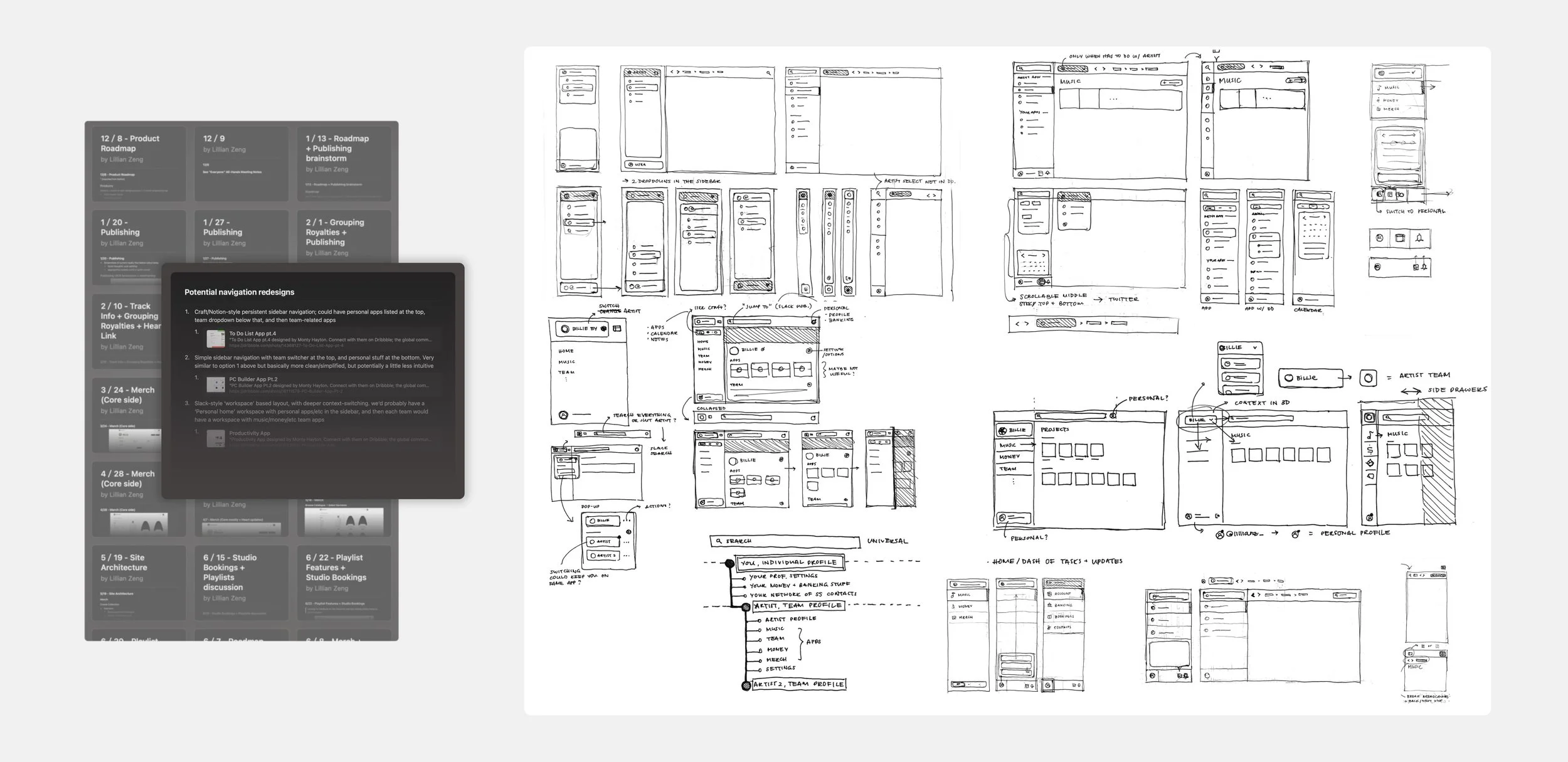
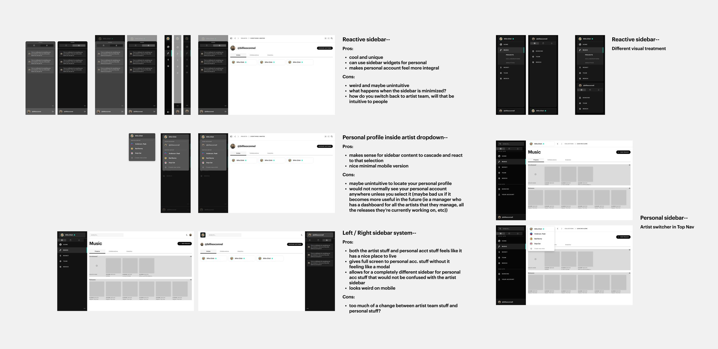
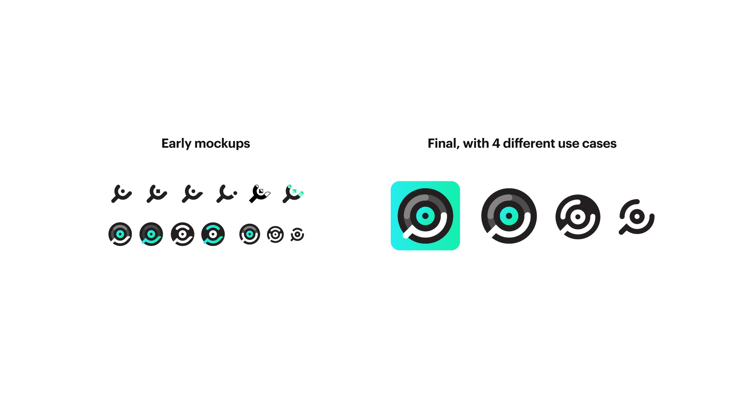
(example) Designing a new navigational sidebar
The lifecycle of a feature
1. Product speccing + early ideation– in collaboration with our engineer and head of product (who’s also our CEO) I come up with a product spec document, containing usually some inspiration points, essential UX requirements, and notes on design ideas. I work off this document for my initial sketching, which I typically do on good old pen/paper.
2. Wireframing + iterating– at this stage, I build basic wireframes that communicate a handful of directions I feel are strongest to pursue. I present these to the team, noting the pros/cons of each and any foreseen design/engineering challenges, or potential UX confusion.
3. Final mockups– after a few iterations based on our conversations, final mockups are produced with polished UI and responsive behavior. Components are added to our library with accompanying stages and documentation.
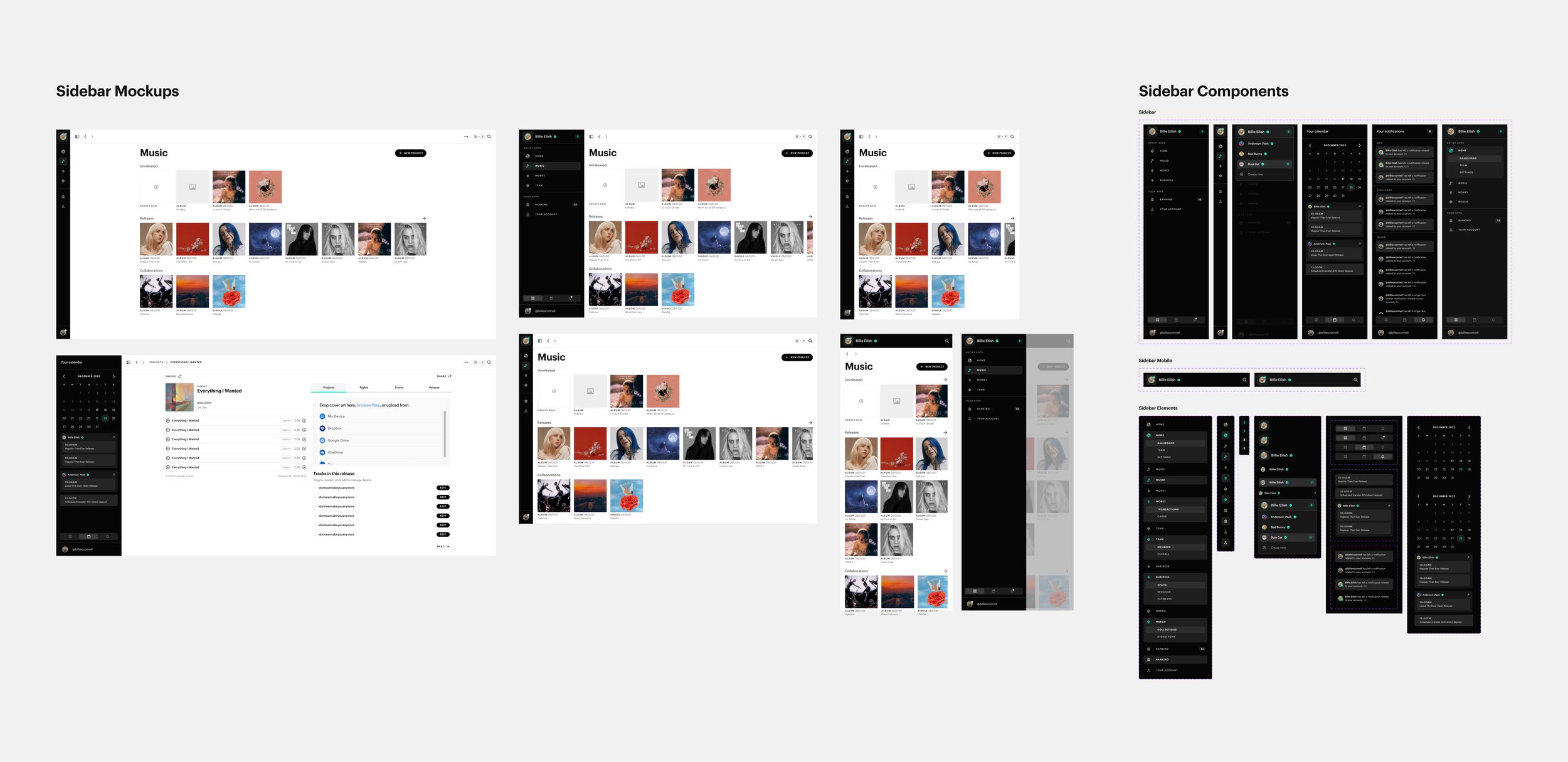
1,200+ custom components, and counting
Building an “all-encompassing” product means that each piece of the platform tackles a massive problem complicated enough that there could easily be a standalone product and team dedicated to just that piece alone. There are competitors in every sector, each of which we aim to be better than. I have to consider what features to prioritize and improve, and how to make it all feel like one cohesive user experience.
The result is a pretty massive component library that’s been built up in just over a year. This process has sped up somewhat exponentially, as I’ve learned to design in a future-facing and efficient manner, keeping in mind when/where it’s appropriate to re-use or re-work existing components, and when/where we need to make something completely new. A challenge along the way has been cleaning up my inconsistencies, maintaining a well-organized system with logical nomenclature.
(1) Release editing flow | (2) Nested track editing flow
UX Philosophies
Along with maintaining consistent UI design, I concern myself with building a consistent feel across the platform as well. What I mean by that is– there’s a few apps that make up the platform so far (Team, Music, Money, and Business), and I want to ensure the user has a seamless experience within each app and when jumping from one to another. To accomplish that, there are a couple guiding philosophies that inform repeated UX flows throughout the platform.
a. Assurance– knowing what you’re doing is correct. Side by side preview/editing views (1) are often employed, allowing users to visualize their end goal, and promoting a sense of accomplishment. Also dynamically alerts users of errors, and shows the the direct consequences of what they’re doing.
b. Clarity & Focus– knowing where you are and what to do. Hierarchy across the platform is always left–right, top–bottom, providing a sense of surrounding context on where you are. There are many linear tasks tucked into focus drawers (2) that pop out when initiated. This makes it less jarring than a full screen modal, and has a sense of impermanence that makes it more comfortable to quickly make small edits. Plus, it’s fast to translate to mobile.
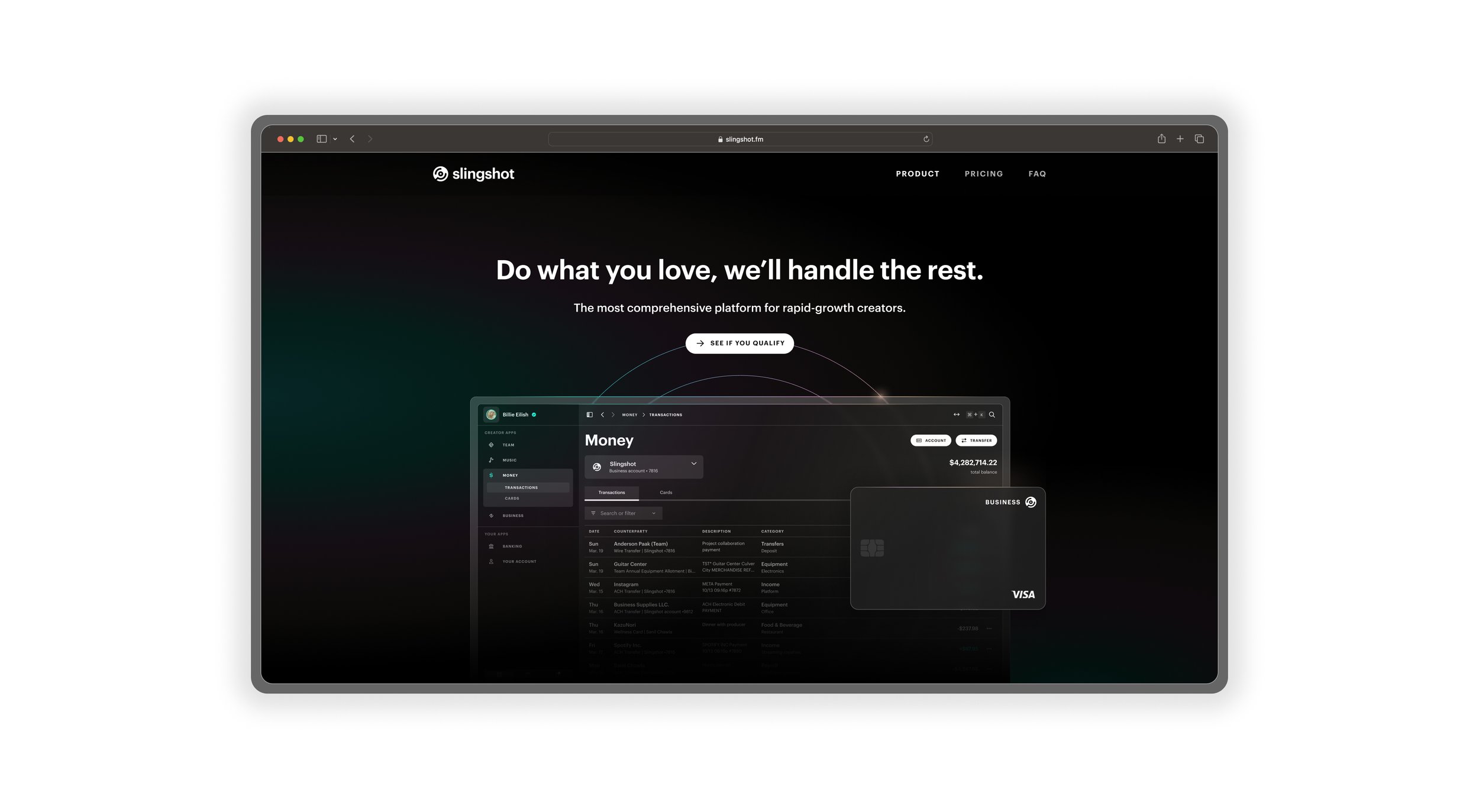
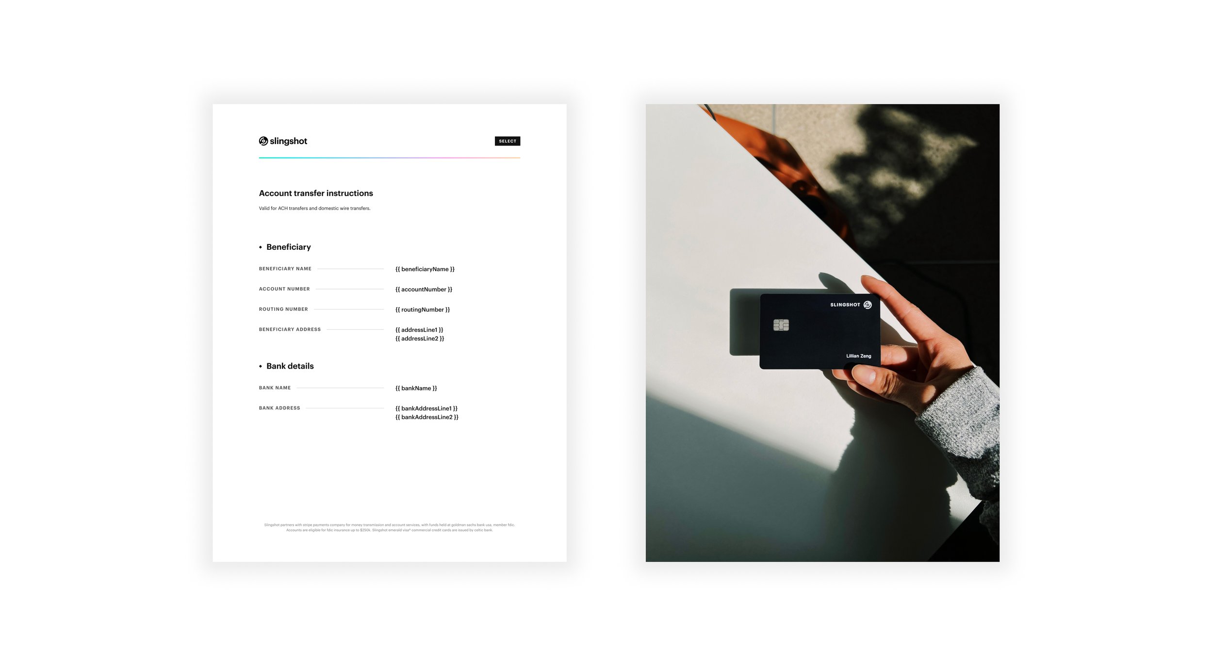
Screens
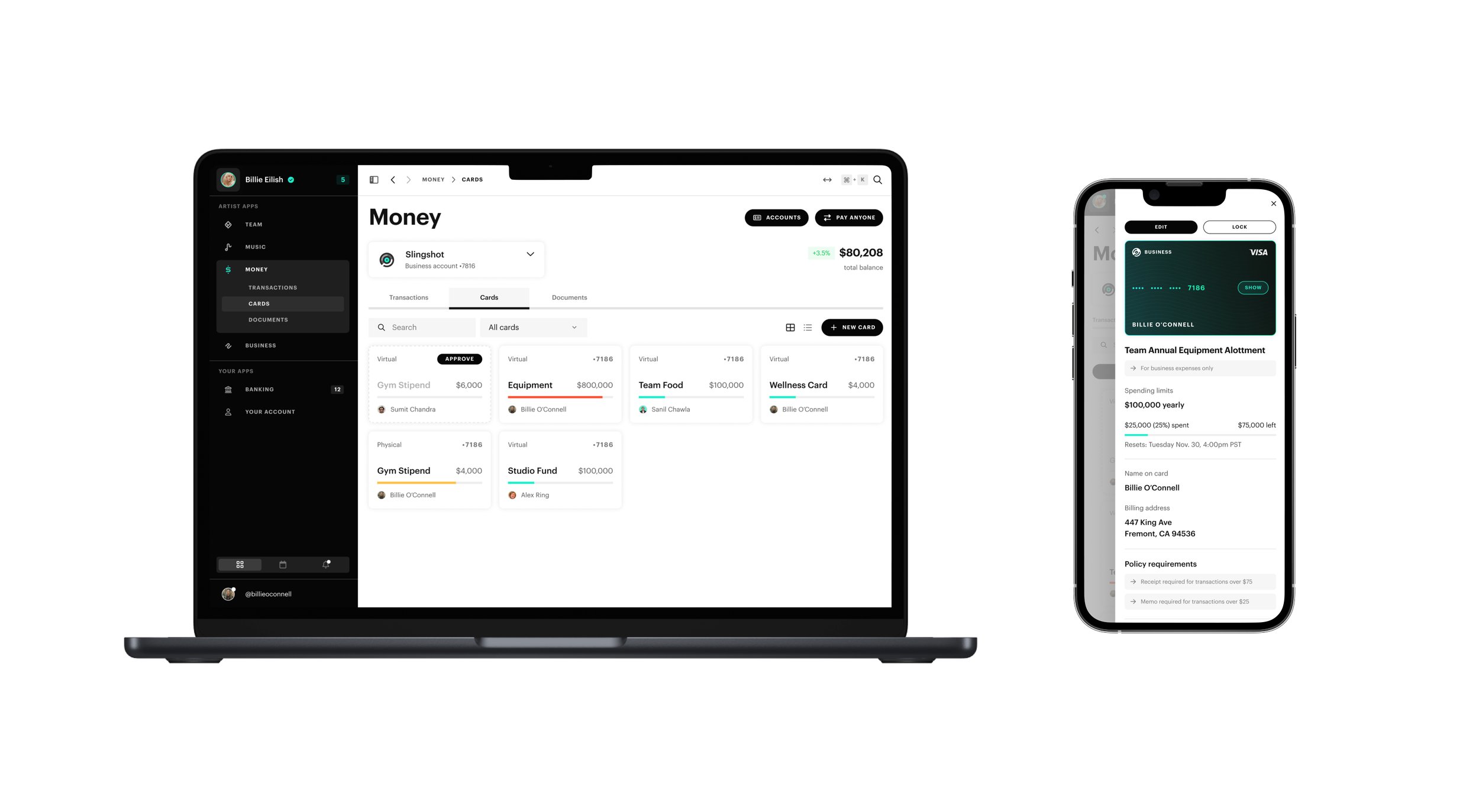
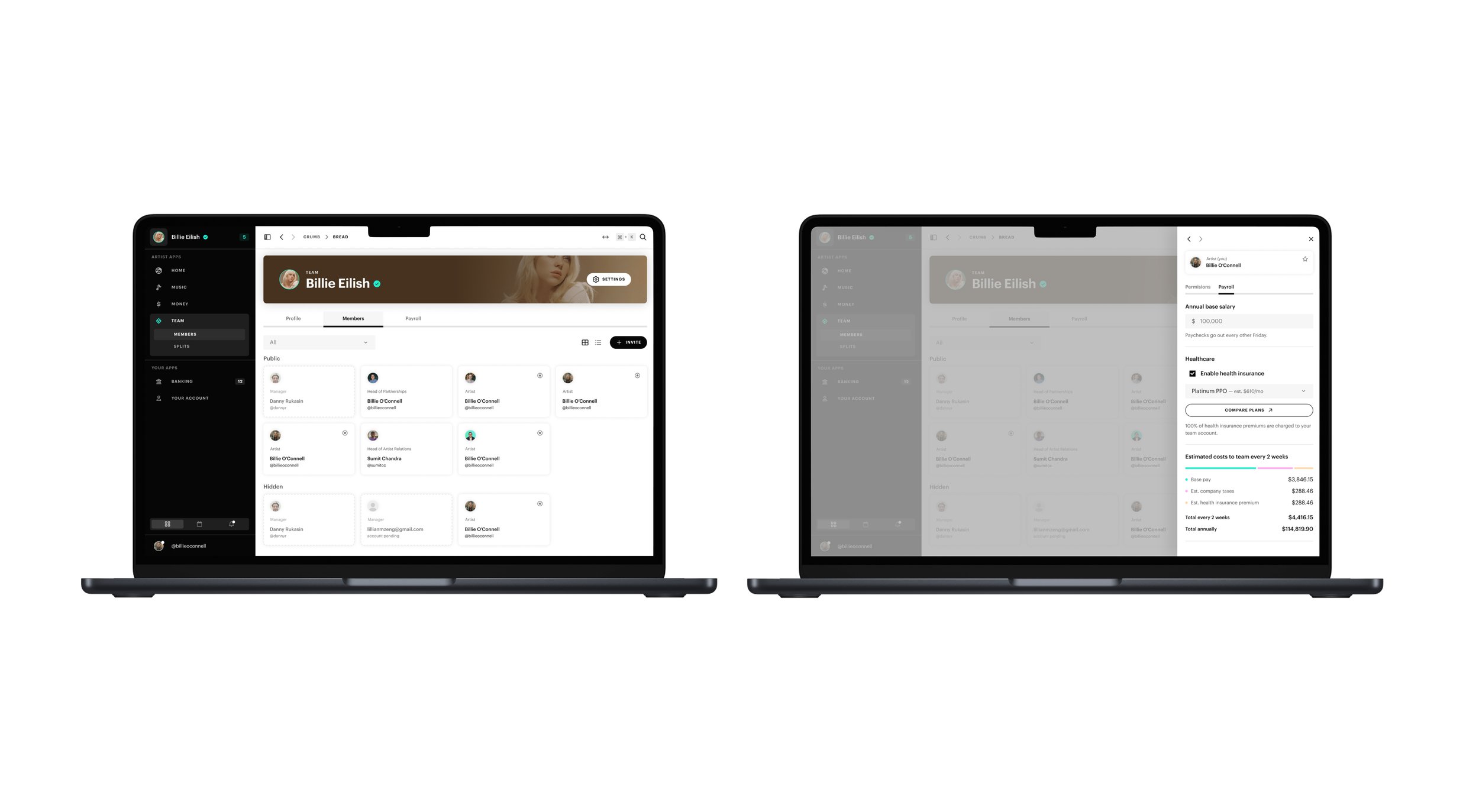
A handful of product shots showcasing our platform.
1. Spending cards dashboard and detailed view.
2. Team member dashboard and detailed view.
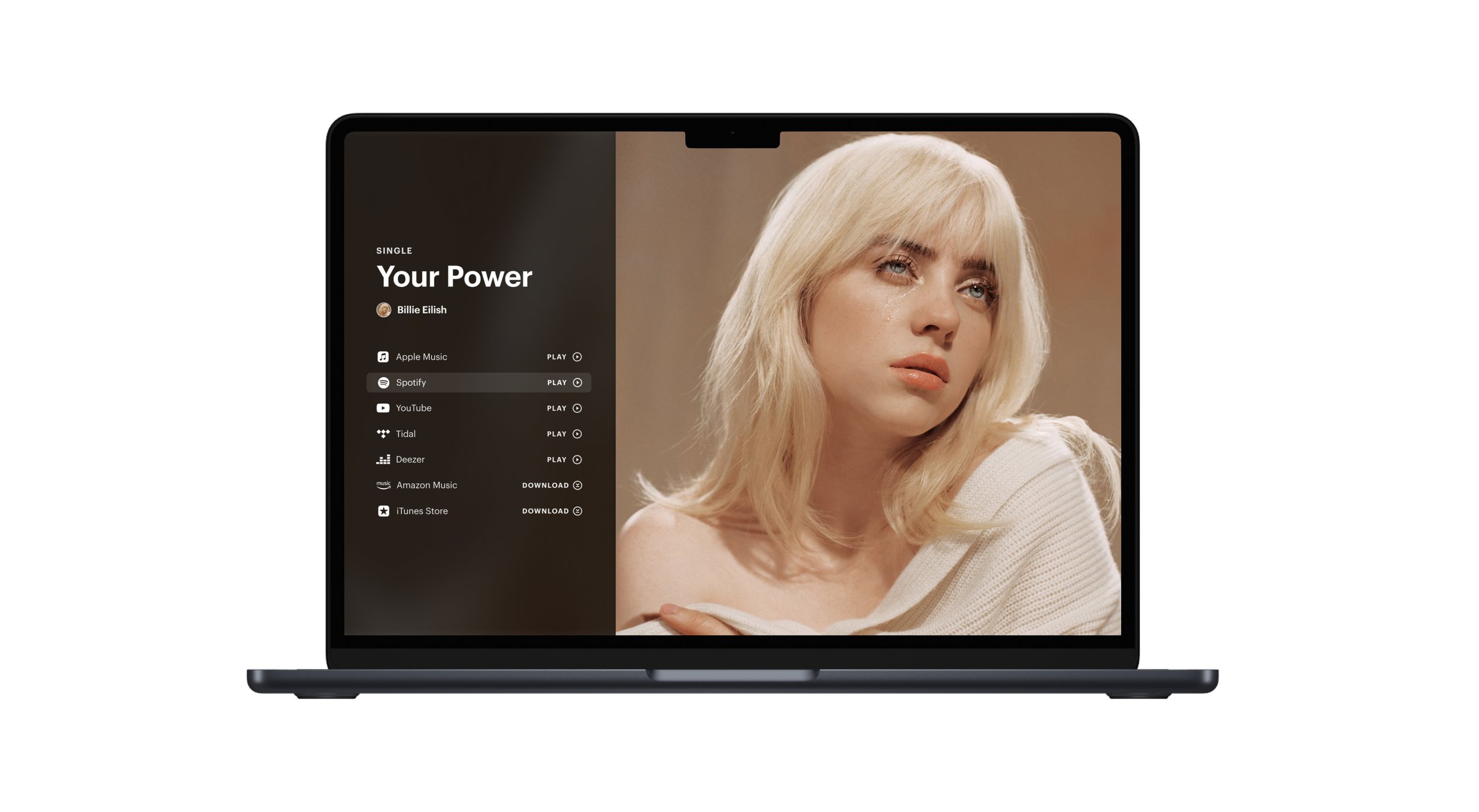
3. Pre-save link page for an artist release. Check out a live version here and a competitor’s equivalent version here.
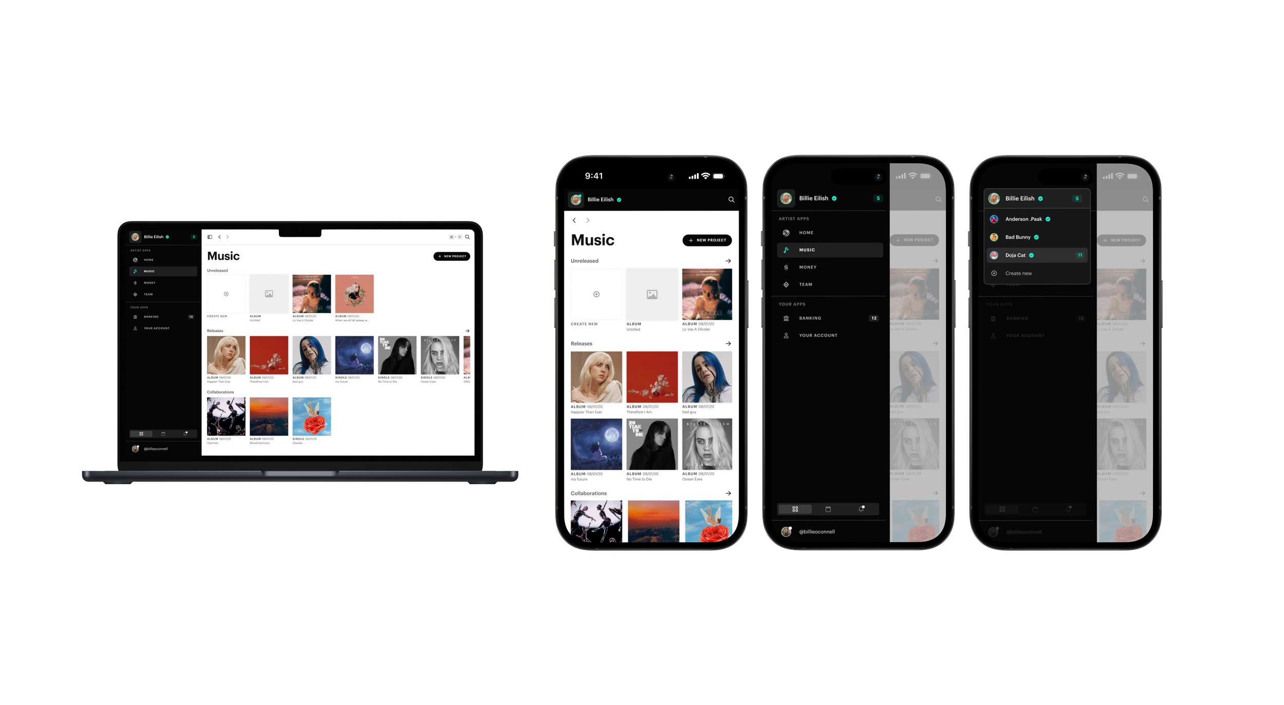
4. Releases dashboard view and artist switching detailed view.
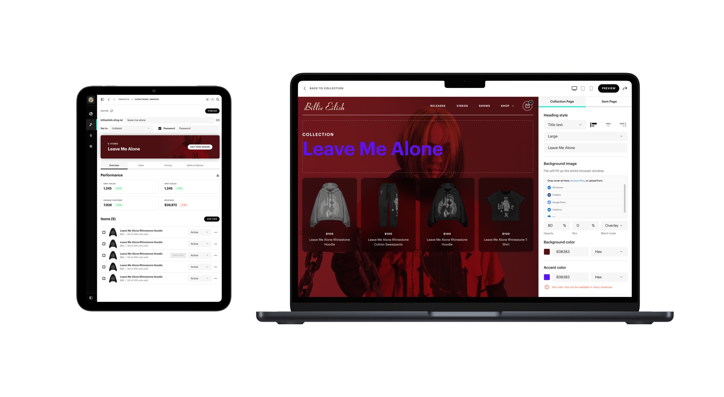
5. Merch shop collection dashboard and merch shop site designer view.