


A personal design exercise executed through a 2020 calendar. 12 graphic design prompts randomly generated from Sharpen Design, 1 prompt per month.
Role– Designer
Date– 01/2020 - now
Biggest Challenge– navigating peculiar prompts and my design thought process
Biggest Takeaway– having fun and challenging myself
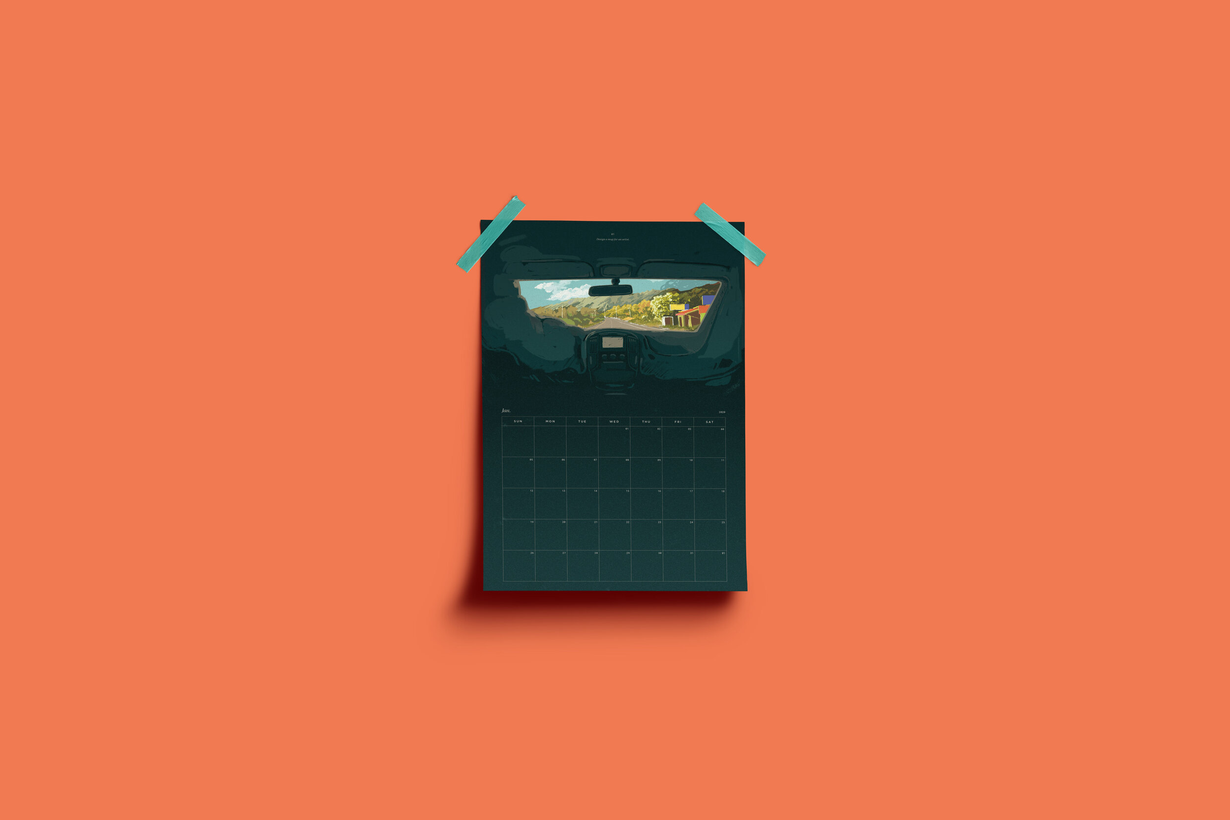
Started this exercise drawing out a complicated map of my messy workspace, then decided that I take too much pride in the fact that, although my art space is messy, I know exactly where everything is, deeming a map useless.
So what does an artist actually look for? I decided the answer is inspiration. Unfortunately, there’s no set route guidance to inspiration and sometimes finding it just requires taking the backseat and seeing where things go.
Struggled with balancing all the variables in this prompt, particularly with introducing holographic elements without deviating too far from Italian aesthetic.
Ended up cheating my way out of really using anything holographic, but I justify it because holo doesn’t really come across in digital anyways…
Had a lot of fun with this one challenging myself to tackle a style of illustration I don’t usually employ. Cartoon figures are not my forte and to this day I struggle to understand how to communicate body & form in such a style.
I based the idea for the sauce off another spicy Japanese condiment: Wasabi.
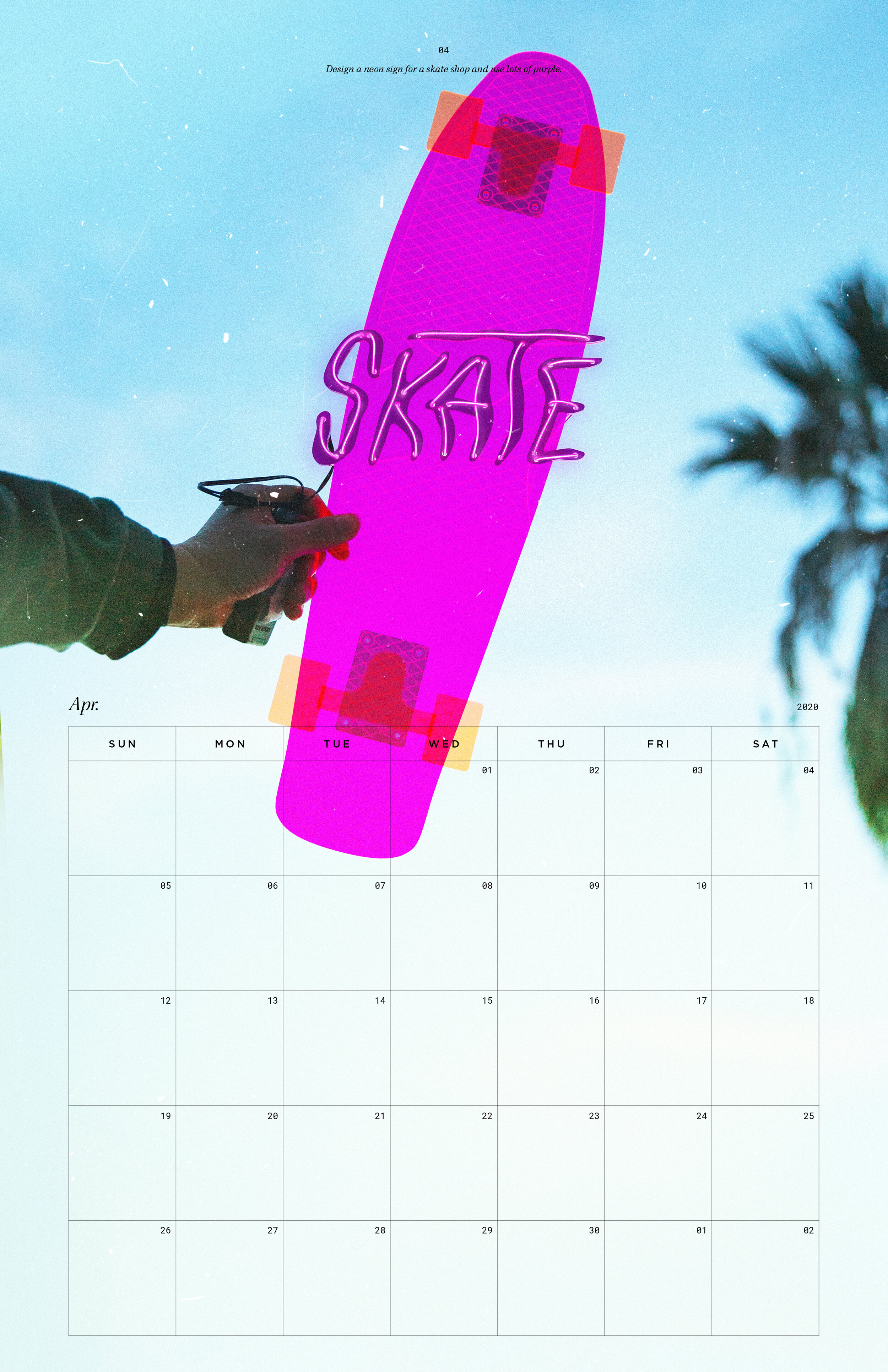
I decided to tackle this prompt in a unique way– exploring outside of 2D design. I made use of fabrication skills I’ve been learning and designed a skate sign that I laser cut onto acrylic. I rigged this up with neon EL wire and a battery pack to create the light up effect of a neon sign, at a much cheaper rate.
Couldn’t decide on which product shot I liked more so I ended up producing two prints for this month :)
This prompt was especially fun to tackle with a semester of astronomy studies under my belt (though I still wouldn’t trust any of the info I made up). Mixed a variety of styles for this– from classic digital illustration to more modern techniques of flat gradients.
This project fell right after finishing Tiger King on Netflix so naturally it’s full of easter egg references (ie. read the first 2 tigers’ names backwards). The trickiest challenge I gave myself was to somehow fit the calendar template into a web module. I wanted the final piece to look both like a graphically designed calendar, and a webpage mockup. Something else I enjoyed was mixing mediums– I first illustrated the tigers with pen on paper, scanned them into Ps where I applied color, and then all pulled them together with various flat vector graphics in Ai, before finally compiling everything into a calendar with Id.
I’m a Californian born and raised but I have loved my frequent trips to New York growing up. Needless to say, I’m very much a tourist in NYC, so I tackled this prompt with a bunch of stereotypical “quintessential” New York imagery. Illustrations were done pen on paper first, then scanned into Ps or Ai for color application. Also– Joe’s Pizza is the best pizza in New York, prove me wrong.
For this prompt I tried to balance a few relevant key factors: the role of a calendar, the role of a newspaper, and the minimal but clever messaging that the Red Cross is known for.
The story is a testimony taken from the Red Cross website, and the a’s, b’s and o’s (the letters of blood types) are highlighted in red throughout, signifying how just as the story would not have been possible without blood donations, the text itself relies on those letters to be readable.
The highlighted blood types are meant to represent the everyday hero, and the double entendre of everyday/every day is used to tie in the calendar module, which has a reminder to donate marked on each day of the month.
TacoZone, a USC staple and local favorite sets up stand just two blocks away from me each night. They’re popular enough to have a completely crowdsourced Instagram page (@istacozoneopen) for hungry students to avoid disappointment. For this prompt I photographed the stand and tried to create a highly editorialized look to bring modern elegance (honestly they deserve a Michelin Star) to the greatest late night snack in LA.
For this prompt, I wanted to focus on one of my favorite aspects of books: their physicality. In 2020, I’ve found reading books on paper (as opposed to digitally) to be one of my favorite mindful activities. So each of these book covers are created out of meticulously hand-cut cardstock, giving their overall finish a subtle touch of dimension and texture. The designs were illustrated based on characters from HBO’s Euphoria, then used as reference for the actual making of the paper covers.
This one challenged me to try my hand at a design style that is recently very on trend, but I’m admittedly new at. I interpreted postmodern graphic design to be heavy with elements such as: typography, bold shapes, bright colors, overlapping and not-too-perfect layouts. I also included a key element of post-modern storytelling: breaking narrative structures and conventions of communicating. I used the phrase “save the date” in overlay with “230 5 Ave, NY, NY // 11/3 at 3 pm,” delivering two key messages in one typographical display.